THE SOUND OF modern simplicity
Because staying relevant means daring to evolve.
Rebranding
Brand Positioning
Launch Video
THE SOUND OF
modern simplicity
Because staying relevant means daring to evolve.

THE CHALLENGE
After more than two decades in business, Aria Solutions had outgrown its visual identity. The identity (and the brand) no longer reflected its expertise, growth, or human-first culture. What began as a logo refresh evolved into a full rebranding journey to rediscover and reveal who Aria had become.
DOWNLOAD FULL CASE STUDYRebox Impact
A trusted partner
Helped a 21-year-old global brand rediscover and express its essence.
5,520+ minutes
Invested in interviews, audits, and positioning work
Global resonance
A new visual language that strengthened internal culture and elevated market perception.
THE APPROACH
Through stakeholder interviews across continents, we uncovered a simple truth: Aria’s distinction lies in its duality, technical precision balanced with empathy. Using the Rebox Brand Positioning Pyramid™, we refined their story around that strength: sophisticated expertise, delivered with humility and warmth.
THE ACTIVATION
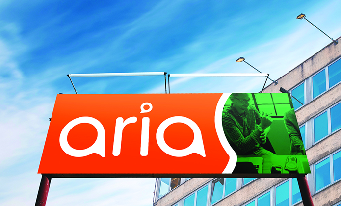
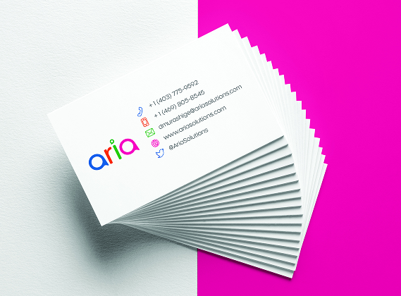
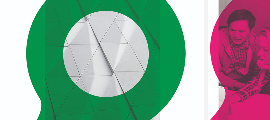
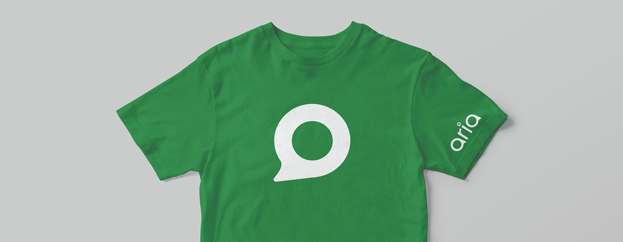
From Aria Solutions to aria, lowercase, approachable, confident. A custom typographic system, four-color palette, and speech-bubble-inspired “a’s” reflected connection and dialogue. Internal celebrations set the tone before the global reveal at a major trade show. The launch video and rollout tools ensured consistency and pride across every touchpoint.
THE IMPACT
Aria’s new identity unified its global team and elevated its market perception. A refreshed brand that balances confidence and approachability; modern, distinct, and deeply human.
"I felt like we were in the right hands,
and they were easy to trust."